Category Archive: Events
Drones kick off new Digital Edge Journalism seminar series
January 11, 2013
S.I. Newhouse students return to class on Monday, just in time to RSVP for our new Digital Edge Seminar series hosted by Journalism Innovation Chair Dan Pacheco. The first in the series is about inexpensive flying camera drones, which will allow journalists to get aerial footage that previously was only possible by renting a helicopter. Here are more details about the event, for which you can RSVP on Eventbrite. (Be sure to do that if you to partake of food.)
DRONES ARE COMING TO JOURNALISM
Unmanned aerial vehicles equipped with cameras aren’t just for the military anymore. Thanks to the FAA Modernization and Reform Act of 2012, they’re coming to newsrooms like 60 Minutes and CNN Money, TV and film studios, and even your back yard.
Learn about new opportunities as well as the legal and ethical considerations of camera drones from Professor Dan Pacheco, the S.I. Newhouse school’s Chair of Journalism Innovation.
As a bonus, get the opportunity to fly the A.R. Parrot 2.0 drone, and learn about our upcoming contest to win a drone of your own.
When: Wednesday, January 23, noon-1:30 p.m.
Where: Newhouse 3, room 432
RSVP: http://newdrone.eventbrite.com
Light snacks will be provided with your RSVP.
Innovative coverage of Election 2012
November 6, 2012
Election Day is always one of the most exciting days in any newsroom. The rush of breaking news, the crunching of data late into the night, covering stories that matter to the country and to your community, make it one of the most exhilarating days to be a journalist. And with the growth of digital news, it’s become one of the most exciting days to be a news consumer.
Following on our list of the most innovative coverage of Superstorm Sandy last week, we’re gathering a list of the most innovative and interesting Election 2012 coverage. This list is by no means exhaustive and it is very much a work in progress, so if you know of anything innovative or interesting, please let us know and we’ll do our best to add it.
UPDATED Wednesday, Nov. 7, 10 a.m.
Results
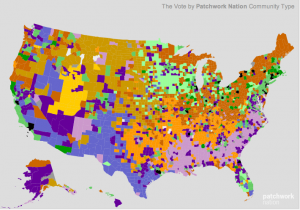
 WNYC/PATCHWORK NATION: In all forms of media, we see a lot of forms of the red state/blue state map. WNYC, partnering with Patchwork, did it one better. This map breaks down election results not just by county, but also by the demographic features of counties. It’s an incredibly rich map of data that goes beyond the simple version we usually see.
Huffington Post Live Results: Live results from The Huffington Post. Dan Pacheco, our boss, reports that this worked great on an iPad.
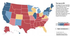
New York Times on shifting demographics: For being the most traditional of “traditional media,” The New York Times is doing some sensational work with multimedia presentation and data analysis. This feature shows how different demographics voted on Tuesday. It’s a visual representation of how Barack Obama built his base of support to win the election. The Washington Post did a similar feature.
Interactive features
New York Times Swing State Picker: Leading up to today’s Presidential election, the New York Times has a great graphic involving the swing states. Pick the winners in each states to see the updated scenarios for Barack Obama and Mitt Romney.

The Washington Post’s 2012 Election Map: The Post is providing not just state-by-state information, but county-by-county. Click on any state, and then you can pick a county to see how it voted in past elections as well as live results as results come in tonight. There are maps also available for senate and congressional races.
Coverage of the media
4thestate If you’re interested in seeing infographics depicting media coverage of the election, including the social influence the media has on elections, check out this site. (thanks to Dr. Rebecca Ortiz at Texas Tech University)
Citizen journalism
Princeton Election blog: Live running coverage of the election, including predicted results, from the Princeton University academic community. It’s interesting to see the election news and poll results through an academic lens. (thanks to Jared Paventi for the link.)
Video the Vote: One of the big issues so far this election have been accusations of voter suppression. This site encourages voters to document any alleged incidents by taping them on their smartphones and posting them to this site, creating a real time document of the allegations.
My Fair Election: Long lines and long waits at the polls have been a defining feature for many early in this election. My Fair Election asks people to report their experiences, in the hopes of being a database for reporters and others interested in making elections better and more transparent.
Aggregation/curation
Huffington Post Twitter list: The Huffington Post has collected 270 (the magic number in Presidential elections) Twitter feeds that are covering the election. This is a fantastic place to start to get the most up-to-date news on social media.
Social media
Knightlab Tweetcast: This is pretty neat – the Knight Lab at Northwestern University has created an algorhythm that lets you predict how you (or anyone else) will vote by analyzing that person’s Twitter feed. Simply plug in the user name and see who they will presumably vote for.
Real-time election infographic: This is a live infographic from Salesforce based on social media conversations, monitoring what topics people are talking about right now.
Electiongrams: One of the big things we’ve seen in the past few weeks is the rise of Instagram as source for real-time photojournalism of breaking news stories. For the election, NBC is aggregating instragram photos from users and is sorting them by state. Similar projects are being done by PBS and by Foursquare (Big thanks to Jeff Sonderman at Poynter for writing these up earlier today).
One note: It may be illegal to publish a picture of your ballot.
USA Today Twitter Election Meter: Think of this as like a real-time measurement of Twitter discussions. From the site: “The Twitter Political Index is based on gathering the volunteered opinions of people logging on to Twitter. The result is analogous to describing the general tone of political discussion overheard in a café on a given day.” You can view the results either nationally or in swing states.
Storify the Election: It’s no surprise that Twitter was insanely busy last night. This aggregation of last night’s tweets is effective in its thoroughness.
Facebook Voting map: If you’re on Facebook, you had the chance to click an “I Voted” button when you logged in on Tuesday. Facebook aggregated that data into a map, showing the number of people who voted and broke it down by state and gender (among other variables).
Print
Star-Tribune preview page OK, so print is far from innovative these days. But we can’t ignore good things that are happening in print, and the Star-Tribune’s election preview page is as good as we’ve seen.
College news:
Democracy in action: We at Syracuse University are very proud to be a part of Democracy In Action, in which college students across the country are doing original reporting and telling stories of the 2012 election. Students are doing a variety of reporting styles (multimedia, social, traditional), and we wanted to give them their due.They’re also doing a live stream through Scribble.
Innovative coverage of superstorm Sandy
October 30, 2012
First of all, we hope you are safe and that your loved ones are safe. Our thoughts and prayers go out to everyone affected by Hurricane / Superstorm Sandy.

A PATH station in Hoboken, N.J. flooded in the storm surge of Hurricane Sandy on Monday, Oct. 29, 2012. (AP Photo/Port Authority of New York and New Jersey)
Natural disasters bring out many of the cliches of traditional media (reporters standing in the middle of a storm surge, photos of empty store shelves, and so on). But they also bring out some of the best and most useful work journalists perform for the public: keeping people informed about what’s happening in real time, helping them find local assistance, identifying dangerous areas to avoid, and telling those who aren’t in harm’s way how they can help.
With that in mind, we’ve been looking for the most innovative digital coverage of Hurricane Sandy. Here’s what we’ve found so far. Found something else? Post a comment below.
Local Resources and Grass Roots Media
- Jersey Shore Hurricane News: Operating completely on Facebook, this “bottom-up, two-way news outlet” is posting photos, videos and critically important aid information to people on the New Jersey coastline and many others who are looking for ways to help. It’s also serving as a community hub for people who are looking for missing people and lost pets. The site launched after Hurricane Irene in 2011 with 27,00 followers, and is already up to over 140,000.
- MTA on Flickr: The Metropolitan Transportation Authority that’s responsible for the New York subways and buses is posting photos of the transportation damage on its Flickr feed.
- The Hurricane Hackers group, a project of the MIT Media Lab that software programmers and data geeks are using to create new tools to assist during the aftermath of the storm.
- CNN iReport Sandy Damage Open Story: CNN-curated user videos of hurricane damage zones. Every video shows its location on a map to the side, and you can navigate through the map to find videos of specific areas. Users can also upload to the page, or from the iReport app.
Maps and Mapping APIs
- New York Times’ Power Outage Map: Shows power outages in and around New York City, with time graphs showing how many customers are without power. Updated every 15 minutes.
- The Guardian’s Sandy Map: The Guardian’s Data Blog is tracking and mapping verifiable events in Sandy’s aftermath. Every event includes a link to more info, and the ability to download full data as a Google Fusion table. (Thanks to our friends at the Center for Innovation in College Media for sharing this).
- Google’s Hurricane
#Sandy map showed the most recent hurricane cone prediction as it approached land, but also has other information layers — such as storm surge probability.
Live Coverage, Curation and Aggregation
- DigitalFirst Media’s Hurricane Sandy News: This topical aggregation page was going all day and night featuring the latest news from affected areas. It took wire reports, local reports, and combined them into one site.
- New York Times’ Sandy Webcam: The New York Times put a webcam on top of its roof and posted an updated picture every minute — now compiled into an animation. It provides a time-lapsed view of the storm over three days.
- Buffy’s World: Buffy Andrews of the York Record created several interesting and well-done slideshows on her blog using photos found via social media.
Data Visualization and Infographics
- Hint.fm’s Wind Map: A beautiful visualization of surface wind data from the National Digital Forecast Database, revised once per hour. Note that while the map uses real data, it should not be used for navigation, flight planning or anything mission-critical.
- New York Times Infographics: The Times also posted some good interactive infographics the morning after the storm.
- WNYC Flood Gauge: WNYC in New York had a real-time flood gauge, allowing people to see exactly how high the New York City rivers were in real time.
Creative Use of APIs, Data

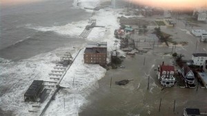
The Inlet section of Atlantic City, N.J. is flooded as Hurricane Sandy makes it approach on Monday Oct. 29, 2012. (AP Photo/6abc Action News, Dann Cuellar.
- Instacane: Instagram is growing in popularity as a news source in breaking news, as people are using it to share and post photos they take (rather than Flickr, Facebook or Twitter). This app allows users to create galleries of Instagram photos.
- The IRE News blog has a great post about how data journalists spread information about the storm.
- NJ.com #NJopen Twitter Feed: Sometimes the best innovations are also the simplest. NJ.com is using the Twitter API to pull in live tweets hashtagged #njopen and #njgas so residents can quickly find out where to get food, and where to get gas.
Fact Checking
- Poynter’s Fake Photo Tips: There were plenty of photos posted yesterday that were fakes, either new or recycled from other disasters. Poynter provided some good tips on how to spot a fake.
- The Atlantic also did its best to fact-check them and clearly label the fakes.
Noteworthy New Tools
- SeeClickFix: This app for iOS and Android lets you post problems that need to be fixed. The startup made its platform available for free to any media in hurricane affected areas to create widgets.
All photos on the main page linking to this post are courtesy of the Associated Press.
– Dan Pacheco & Brian Moritz.
Brainstorming sessions for News App contest
October 18, 2012
As we announced yesterday, we’re excited to be a part of the SU Student App Competition. We’re offering a $500 prize for the best student-designed news/journalism/civic media app.
 If you want more information on the contest, if you have an idea for an app but don’t know what to do next, or if you’re interested in this but don’t know where to start, we’re holding a couple of brainstorming sessions in the next two weeks:
The first is Wednesday, Oct. 24, 12:30 p.m. The second is Monday, Oct. 29, 12:30 p.m.
Both sessions will be held in our office in Newhouse 2, Room 494. We’ll provide some food and the space to work on your idea and maybe find some collaborators.
If you have any questions, you can email Dan or Brian. Or follow us on Twitter.
Dan Pacheco at Communications and Society Class
October 4, 2012
Dan Pacheco, our Chair of Journalism Innovation, recently spoke to a Newhouse Communications and Society class about the history of participatory media in journalism, and where things are headed next. Here’s a Storify of real-time reactions to his presentation and some additional commentary.

