Monthly Archives: November 2012
Journovator spotlight: The Bly Project
November 15, 2012
Our latest Journovator Spotlight falls on a group featuring a pair of our own graduates from the Newhouse School – The Bly Project. We caught up with the founders at Spot Coffee in Rochester. You can watch the interview here (apologies for the coffee making in the background).
[youtube]http://youtu.be/u-FabIVzMr0[/youtube]
About The Bly Project
The Bly Project is Leah Stacy, Pete Wayner and Kevin Kennedy. Leah and Pete received their masters’ degrees from Syracuse – Leah was an arts journalism major, Pete was a magazine, newspaper and online journalism major. The three created The Bly Project, which they describe as “immersion travel journalism for social good.”
To get things moving, they created a pitch on Kickstarter that attracted $3,895 from 92 backers. They then used those funds to travel across the country, starting from their home in Rochester, N.Y. and culminating in Austin, Texas. They interviewed people along the way about what the American Dream means to them and compiled them into a series of multimedia stories that you can read on The Bly Project site.
Innovative coverage of Election 2012
November 6, 2012
Election Day is always one of the most exciting days in any newsroom. The rush of breaking news, the crunching of data late into the night, covering stories that matter to the country and to your community, make it one of the most exhilarating days to be a journalist. And with the growth of digital news, it’s become one of the most exciting days to be a news consumer.
Following on our list of the most innovative coverage of Superstorm Sandy last week, we’re gathering a list of the most innovative and interesting Election 2012 coverage. This list is by no means exhaustive and it is very much a work in progress, so if you know of anything innovative or interesting, please let us know and we’ll do our best to add it.
UPDATED Wednesday, Nov. 7, 10 a.m.
Results
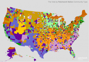
 WNYC/PATCHWORK NATION: In all forms of media, we see a lot of forms of the red state/blue state map. WNYC, partnering with Patchwork, did it one better. This map breaks down election results not just by county, but also by the demographic features of counties. It’s an incredibly rich map of data that goes beyond the simple version we usually see.
Huffington Post Live Results: Live results from The Huffington Post. Dan Pacheco, our boss, reports that this worked great on an iPad.
New York Times on shifting demographics: For being the most traditional of “traditional media,” The New York Times is doing some sensational work with multimedia presentation and data analysis. This feature shows how different demographics voted on Tuesday. It’s a visual representation of how Barack Obama built his base of support to win the election. The Washington Post did a similar feature.
Interactive features
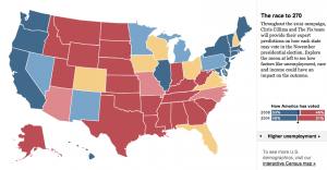
New York Times Swing State Picker: Leading up to today’s Presidential election, the New York Times has a great graphic involving the swing states. Pick the winners in each states to see the updated scenarios for Barack Obama and Mitt Romney.

The Washington Post’s 2012 Election Map: The Post is providing not just state-by-state information, but county-by-county. Click on any state, and then you can pick a county to see how it voted in past elections as well as live results as results come in tonight. There are maps also available for senate and congressional races.
Coverage of the media
4thestate If you’re interested in seeing infographics depicting media coverage of the election, including the social influence the media has on elections, check out this site. (thanks to Dr. Rebecca Ortiz at Texas Tech University)
Citizen journalism
Princeton Election blog: Live running coverage of the election, including predicted results, from the Princeton University academic community. It’s interesting to see the election news and poll results through an academic lens. (thanks to Jared Paventi for the link.)
Video the Vote: One of the big issues so far this election have been accusations of voter suppression. This site encourages voters to document any alleged incidents by taping them on their smartphones and posting them to this site, creating a real time document of the allegations.
My Fair Election: Long lines and long waits at the polls have been a defining feature for many early in this election. My Fair Election asks people to report their experiences, in the hopes of being a database for reporters and others interested in making elections better and more transparent.
Aggregation/curation
Huffington Post Twitter list: The Huffington Post has collected 270 (the magic number in Presidential elections) Twitter feeds that are covering the election. This is a fantastic place to start to get the most up-to-date news on social media.
Social media
Knightlab Tweetcast: This is pretty neat – the Knight Lab at Northwestern University has created an algorhythm that lets you predict how you (or anyone else) will vote by analyzing that person’s Twitter feed. Simply plug in the user name and see who they will presumably vote for.
Real-time election infographic: This is a live infographic from Salesforce based on social media conversations, monitoring what topics people are talking about right now.
Electiongrams: One of the big things we’ve seen in the past few weeks is the rise of Instagram as source for real-time photojournalism of breaking news stories. For the election, NBC is aggregating instragram photos from users and is sorting them by state. Similar projects are being done by PBS and by Foursquare (Big thanks to Jeff Sonderman at Poynter for writing these up earlier today).
One note: It may be illegal to publish a picture of your ballot.
USA Today Twitter Election Meter: Think of this as like a real-time measurement of Twitter discussions. From the site: “The Twitter Political Index is based on gathering the volunteered opinions of people logging on to Twitter. The result is analogous to describing the general tone of political discussion overheard in a café on a given day.” You can view the results either nationally or in swing states.
Storify the Election: It’s no surprise that Twitter was insanely busy last night. This aggregation of last night’s tweets is effective in its thoroughness.
Facebook Voting map: If you’re on Facebook, you had the chance to click an “I Voted” button when you logged in on Tuesday. Facebook aggregated that data into a map, showing the number of people who voted and broke it down by state and gender (among other variables).
Print
Star-Tribune preview page OK, so print is far from innovative these days. But we can’t ignore good things that are happening in print, and the Star-Tribune’s election preview page is as good as we’ve seen.
College news:
Democracy in action: We at Syracuse University are very proud to be a part of Democracy In Action, in which college students across the country are doing original reporting and telling stories of the 2012 election. Students are doing a variety of reporting styles (multimedia, social, traditional), and we wanted to give them their due.They’re also doing a live stream through Scribble.